
How Pantone Helps to Choose Color for My Clothing Line?
- Billoomi Fashion Pvt. Ltd

- Apr 23, 2020
- 3 min read
There are millions of possibility when it comes to choose the color for a garment. Being a fashion entreprenure surely you could be having your own study or gut feel behind choosing the right color. But even if you have decided the color, how will you communicate to your womens clothing manufacturer so that exactly same color fabric can be dyed?
Being a high quality womens clothing manufacturer, A1 Clothing Factory deals with several fashion designers and clothing label owners. We have closely observed that since years Pantone has been undisputed leader in color guide for most of our clients. The moment it comes to choose color for a clothing line A1CF effectively meet the desired color chosen by its clients., be it children clothing or kids clothing, women wear / women clothing, men's wear multi color t-shirt manufacturing; it requires only one reference - Pantone Color Code. Rest A1CF efficiently matches the color asked for through dyeing process. Pantone has greatly recognized as color standard company and garment industry has been one of the biggest customers so far.
The History of Pantone
Founded in the 1950s, Pantone originally manufactured color cards for cosmetic companies. Lawrence Herbert, a young chemist, saw that the company’s process could solve a more widespread problem: the lack of color standardization. There was no language for communicating about and reproducing colors. There was no consistency, which caused a large amount of rework and reprinting in the graphics industry.
Consider this: Would National Geographic’s iconic yellow border have become so memorable if February’s edition looked more chartreuse while April’s border was tinted a shade of mustard?
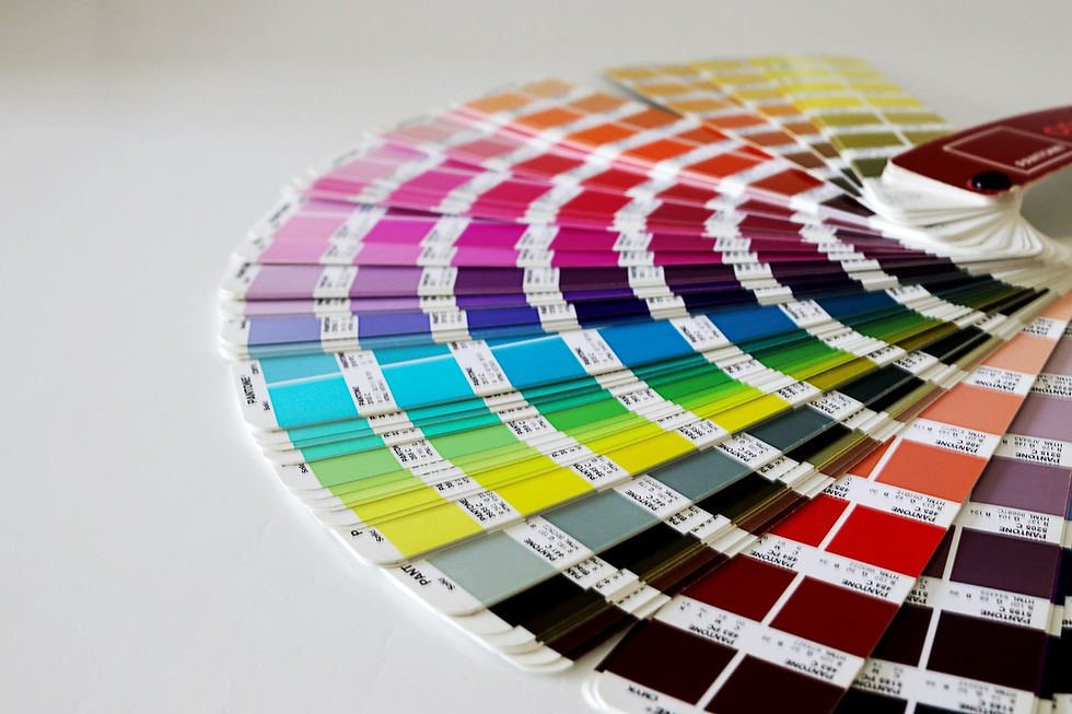
Seeing the opportunity, Herbert bought the company in 1962 and forwent medical school to focus on creating a color system now known as the Pantone Matching System (PMS), which began as 10 standardized colors and today consists of more than 10,000.
These colors chips, printed in the recognizable fan book format, give designers and printers the tools to communicate about something color -- something most people perceive differently. Pantone created a common language whereby designers, artists, printers, and clients could definitively choose Pantone 212 C, not 213 C or 205 C, and then printers would know how much of 14 different pigments they should add to create that exact color.
But the brand didn't stop at creating new combinations of yellow, blue, purple, red, etc. Pantone recently created color standards for the fashion and interiors industry, has a consultancy practice whereby its works with brands, produces color trend forecasting guides, and has launched itself as a lifestyle brand -- owning a Pantone-inspired product is just another way for a person to show her appreciation of good design.
How Pantone Branded Color
Pantone's emergence as the most well-known color standards company -- and yes, there are competitors -- is partly due to its longevity in the industry. But it's also because of the brand's smart marketing plays that Pantone has come to be about more than the science of creating and matching colors. The brand employs color psychologists and color economists who explain the feelings the colors should evoke, not just their chemical makeup.
Leatrice Eiseman, the executive director of the Pantone Color Institute, gave a statement to the New York Times in 2007 on that year's selection: “Blue Iris brings together the dependable aspects of blue, underscored by a strong, soul-searching purple cast. Emotionally, it is anchoring and meditative with a touch of magic.”
This year's selection was released with this statement: "As consumers seek mindfulness and well-being as an antidote to modern day stresses, welcoming colors that psychologically fulfill our yearning for reassurance and security are becoming more prominent. Joined together, Rose Quartz and Serenity demonstrate an inherent balance between a warmer embracing rose tone and the cooler tranquil blue, reflecting connection and wellness as well as a soothing sense of order and peace."
It continues: "In many parts of the world we are experiencing a gender blur as it relates to fashion, which has in turn impacted color trends throughout all other areas of design."
The Influence of Color
Pantone has become so recognizable both within and outside of the design community that its brand has inspired other artists and designers. There have been Pantone dessert tarts and beer cans. And artist Angelica Dass used Pantone colors to match a person's skintone and challenge our perception of how we define skin color.
Pantone has created a language of color and in doing so, created an opportunity for itself to become both the authority on creating and marketing color as a brand. And to think that all this started with a young chemist who had to hand-mix shades for a retail display so women could choose the right shade of pantyhose.


GMNC bữa mình thấy bạn bè nhắc nên tiện tay mở thử cho biết thôi. Mình không có ngồi đọc kỹ hay làm gì nhiều, chủ yếu nghía xem giao diện có dễ nhìn không. Vào cái là thấy trang sắp xếp khá gọn, khoảng trắng vừa đủ nên không bị ngợp. Mấy mục chính được gom lại theo nhóm nên mình lướt một chút là biết chỗ nào với chỗ nào, khỏi phải mò lâu. Mình cũng thích kiểu họ để thông tin thành từng khối rõ ràng, nhìn qua là bắt được ý chứ không bị chữ dồn dập. Chuyển qua lại giữa các phần cũng ổn, menu nằm chỗ dễ thấy nên thao tác nhanh. Nói chung…
nhà cái 123b mình thấy bạn bè nhắc nhiều quá nên cũng ghé thử cho biết, chủ yếu xem giao diện thôi chứ không ngồi tìm hiểu sâu. Vừa vào là thấy bố cục chia thành từng khối khá rõ, nhìn lướt một vòng là nắm được chỗ nào đang nói gì, không bị rối mắt. Mình để ý cái menu đặt ở vị trí dễ thấy nên chuyển qua lại giữa các mục nhanh, kiểu bấm cái là sang ngay, không phải kéo lên kéo xuống nhiều. Mấy phần thông tin họ trình bày theo dạng bảng cột nên đọc khá “đã”, nhất là khi chỉ muốn xem nhanh tổng quan. Nói chung cảm giác site làm gọn gàng,…
অনলাইনে ব্রাউজ করার সময় হঠাৎ https://betbdt.global/ সম্পর্কে জানতে পারি এবং ওয়েবসাইটটি একবার দেখে নেওয়ার ইচ্ছা হয়। আমি বিশেষ কোনো বিষয় নিয়ে গভীরভাবে অনুসন্ধান করিনি, বরং পুরো সাইটের গঠন ও তথ্য উপস্থাপনা লক্ষ্য করেছি। আমার কাছে ইন্টারফেসটি পরিষ্কার এবং ব্যবহারবান্ধব মনে হয়েছে। মোবাইল ডিভাইস থেকেও সাইটটি ব্যবহার করেছি, সেখানে পেজ লোডিং এবং বিভিন্ন মেনুতে প্রবেশ করতে কোনো সমস্যা হয়নি। প্রথমবারের অভিজ্ঞতা হিসেবে ওয়েবসাইটটি বেশ সহজ এবং সুবিধাজনক লেগেছে।
Great article! I really enjoyed reading about bocaccio and appreciated the detailed information you shared about this species and fishing techniques. Thanks for providing such valuable insights. For more helpful information, you can also click here Sassa Status Check
HZ88 mình mới lướt thử vì thấy bạn bè nhắc hoài, kiểu tò mò xem trang làm có dễ dùng không. Vào cái là thấy giao diện khá nhẹ mắt, không bị nhét chữ dày đặc nên nhìn đỡ ngợp. Mấy mục chính được chia theo khối rõ ràng, kéo xuống là biết mình đang ở phần nào chứ không bị lạc. Mình cũng thích cái chỗ đăng ký đăng nhập đặt ngay tầm nhìn, ai mới vào chắc cũng bấm được liền, khỏi phải mò menu. Với lại có phần FAQ “câu hỏi thường gặp” trình bày gọn gàng, đọc lướt vài dòng là nắm ý, giống kiểu hộp thông tin nên không rối. Nói chung bố cục trang…