
How Pantone Helps to Choose Color for My Clothing Line?
- Billoomi Fashion Pvt. Ltd

- Apr 23, 2020
- 3 min read
There are millions of possibility when it comes to choose the color for a garment. Being a fashion entreprenure surely you could be having your own study or gut feel behind choosing the right color. But even if you have decided the color, how will you communicate to your womens clothing manufacturer so that exactly same color fabric can be dyed?
Being a high quality womens clothing manufacturer, A1 Clothing Factory deals with several fashion designers and clothing label owners. We have closely observed that since years Pantone has been undisputed leader in color guide for most of our clients. The moment it comes to choose color for a clothing line A1CF effectively meet the desired color chosen by its clients., be it children clothing or kids clothing, women wear / women clothing, men's wear multi color t-shirt manufacturing; it requires only one reference - Pantone Color Code. Rest A1CF efficiently matches the color asked for through dyeing process. Pantone has greatly recognized as color standard company and garment industry has been one of the biggest customers so far.
The History of Pantone
Founded in the 1950s, Pantone originally manufactured color cards for cosmetic companies. Lawrence Herbert, a young chemist, saw that the company’s process could solve a more widespread problem: the lack of color standardization. There was no language for communicating about and reproducing colors. There was no consistency, which caused a large amount of rework and reprinting in the graphics industry.
Consider this: Would National Geographic’s iconic yellow border have become so memorable if February’s edition looked more chartreuse while April’s border was tinted a shade of mustard?
Seeing the opportunity, Herbert bought the company in 1962 and forwent medical school to focus on creating a color system now known as the Pantone Matching System (PMS), which began as 10 standardized colors and today consists of more than 10,000.
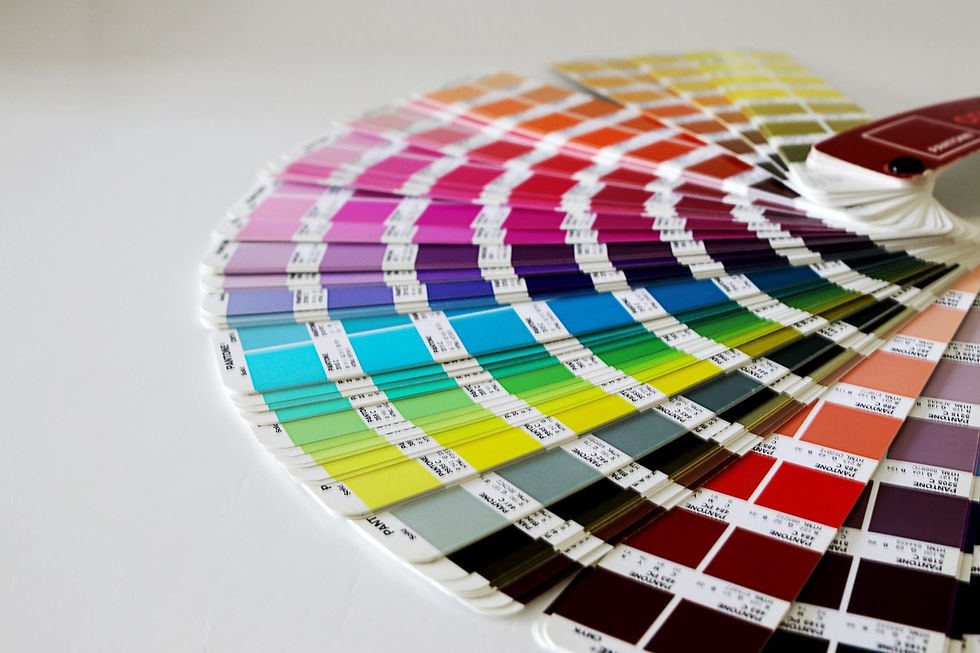
These colors chips, printed in the recognizable fan book format, give designers and printers the tools to communicate about something color -- something most people perceive differently. Pantone created a common language whereby designers, artists, printers, and clients could definitively choose Pantone 212 C, not 213 C or 205 C, and then printers would know how much of 14 different pigments they should add to create that exact color.
But the brand didn't stop at creating new combinations of yellow, blue, purple, red, etc. Pantone recently created color standards for the fashion and interiors industry, has a consultancy practice whereby its works with brands, produces color trend forecasting guides, and has launched itself as a lifestyle brand -- owning a Pantone-inspired product is just another way for a person to show her appreciation of good design.
How Pantone Branded Color
Pantone's emergence as the most well-known color standards company -- and yes, there are competitors -- is partly due to its longevity in the industry. But it's also because of the brand's smart marketing plays that Pantone has come to be about more than the science of creating and matching colors. The brand employs color psychologists and color economists who explain the feelings the colors should evoke, not just their chemical makeup.
Leatrice Eiseman, the executive director of the Pantone Color Institute, gave a statement to the New York Times in 2007 on that year's selection: “Blue Iris brings together the dependable aspects of blue, underscored by a strong, soul-searching purple cast. Emotionally, it is anchoring and meditative with a touch of magic.”
This year's selection was released with this statement: "As consumers seek mindfulness and well-being as an antidote to modern day stresses, welcoming colors that psychologically fulfill our yearning for reassurance and security are becoming more prominent. Joined together, Rose Quartz and Serenity demonstrate an inherent balance between a warmer embracing rose tone and the cooler tranquil blue, reflecting connection and wellness as well as a soothing sense of order and peace."
It continues: "In many parts of the world we are experiencing a gender blur as it relates to fashion, which has in turn impacted color trends throughout all other areas of design."
The Influence of Color
Pantone has become so recognizable both within and outside of the design community that its brand has inspired other artists and designers. There have been Pantone dessert tarts and beer cans. And artist Angelica Dass used Pantone colors to match a person's skintone and challenge our perception of how we define skin color.
Pantone has created a language of color and in doing so, created an opportunity for itself to become both the authority on creating and marketing color as a brand. And to think that all this started with a young chemist who had to hand-mix shades for a retail display so women could choose the right shade of pantyhose.


S8 mình thấy dạo này nhiều người nhắc nên tò mò vào lướt thử vài phút. Giao diện nhìn gọn gàng, nền sáng vừa mắt, đọc chữ không bị rối như mấy trang hay nhồi banner. Mình có xem bài nói về dấu hiệu nhận biết link chính thức, họ tách ý theo từng mục rõ ràng nên lướt nhanh vẫn hiểu đại khái, không cần đọc kỹ từng dòng. Phần giới thiệu thông tin nền (kiểu giấy phép đơn vị quản lý) cũng để riêng thành khối, nên ai quan tâm thì xem, còn không thì kéo qua cũng không bị vướng. Nói chung cảm giác họ biết cách sắp nội dung cho dễ theo dõi, nhất là mấy…
https://ivibetbonusbr.com/bonus-tipos-e-promocoes/ eu caí aí meio sem pretensão, só pra entender como eles organizam as promoções sem ter que ficar clicando em mil coisas. O que achei mais legal é que o texto é bem direto e dá pra sacar rápido umas diferenças, tipo quando eles comentam que cashback geralmente tem rollover menor (e que às vezes nem rola exigência extra, dependendo da regra). Também curti que eles deixam claro que rodadas grátis costumam ser pra slots específicos e que os ganhos podem ter requisito separado, então não fica aquela dúvida chata de “serve pra qualquer coisa?”. No geral, dá pra ler de boa porque tudo fica separado em blocos e os títulos já te levam certinho pra cada parte do…
https://ivibetbonusbr.com/bonus-tipos-e-promocoes/ eu caí aí meio sem intenção, só pra entender como eles explicam essas paradas sem ficar pulando de página em página. O que achei legal é que o texto é bem direto e dá pra sacar rápido a diferença entre as promoções, tipo quando eles comentam que cashback costuma ter rollover menor (e às vezes nem tem extra, dependendo da campanha). Isso já evita aquela dúvida chata de “tá, mas qual vale mais a pena ler primeiro?”. Também curti que não fica jogando termos soltos, eles dão um contexto simples e pronto, sem enrolação. E visualmente ajuda bastante porque fica tudo separado em blocos com títulos bem claros, então dá pra bater o olho e achar o trecho que…
MegaPari caiu no meu radar esses dias e eu entrei mais pra ver como o site é montado do que pra apostar de verdade. De cara dá pra notar que eles tentam deixar tudo no mesmo lugar (apostas e cassino) sem te jogar num labirinto de botão, o que eu achei bem tranquilo pra quem só quer se situar. Outra coisa que me chamou atenção foi o jeito “guia” do texto, com aqueles avisos de conferir regras e a parte de verificação antes de sair colocando documento ou dado bancário — passa um ar mais responsável. Não fiquei fuçando jogo por jogo, foi bem visita rápida mesmo. No geral, dá pra escanear a página fácil porque as informações ficam separadas…
https://qs88.design/ mình tình cờ thấy ai đó share nên bấm vào nghía thử cho biết. Vừa vào là thấy giao diện khá dễ chịu, kiểu tối giản mà không bị trống, các khối nội dung chia rõ nên đọc lướt vẫn hiểu họ đang nói gì. Mình có để ý họ nhắc chuyện thao tác nhanh trên nhiều thiết bị, nên mình mở thử trên điện thoại luôn thì chuyển trang ổn, không bị giật hay loạn chữ. Mình không kiểu ngồi soi game hay ưu đãi gì đâu, chỉ xem cách họ trình bày thông tin thôi. Phần tiêu đề với đoạn mô tả tách bạch, nhìn phát biết đâu là giới thiệu chung, đâu là phần giải thích…